Build a House game | National Trust
This is my response to a {speculative} brief from the National Trust to provide illustration for and redesign the box of classic game Build a House.
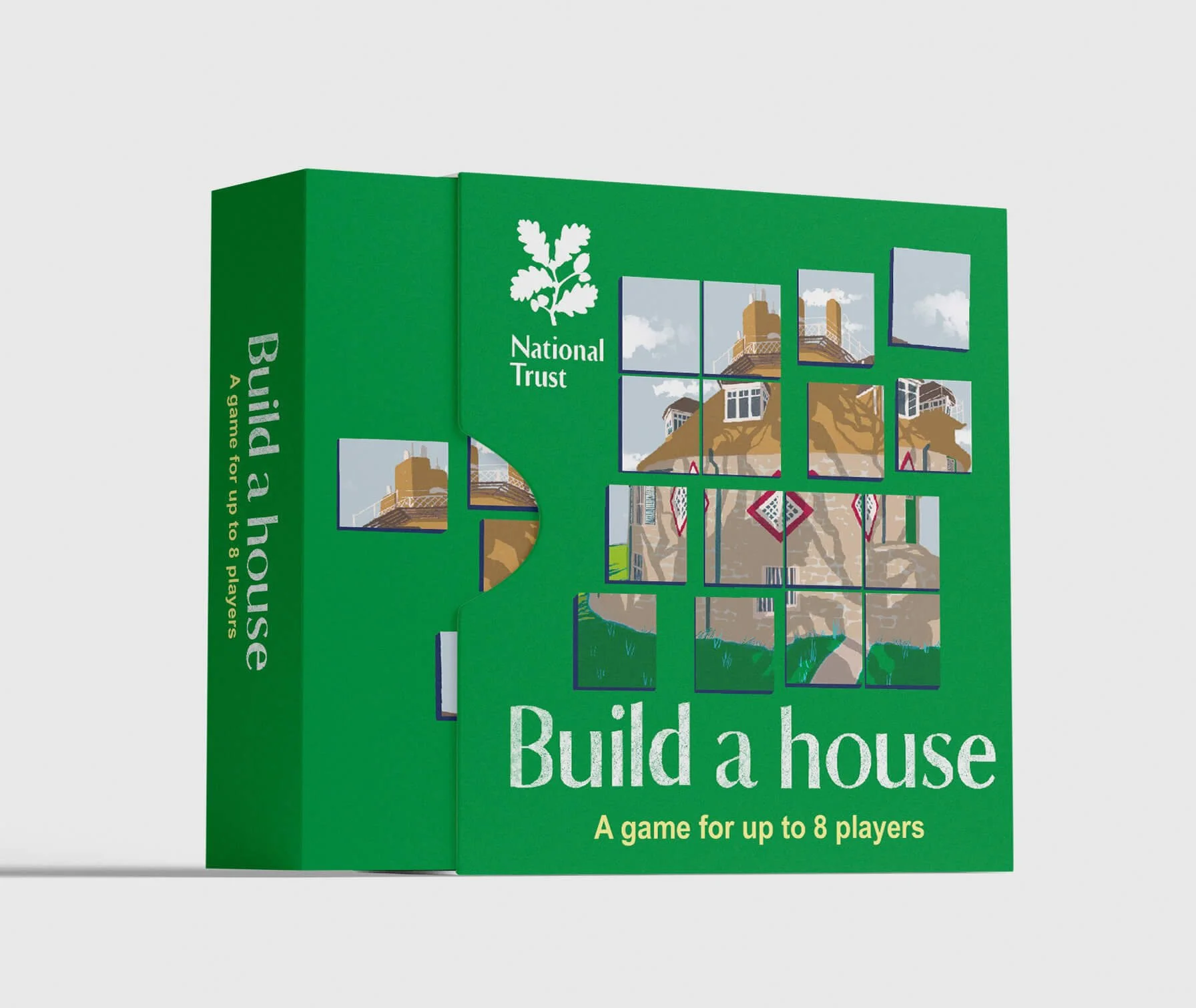
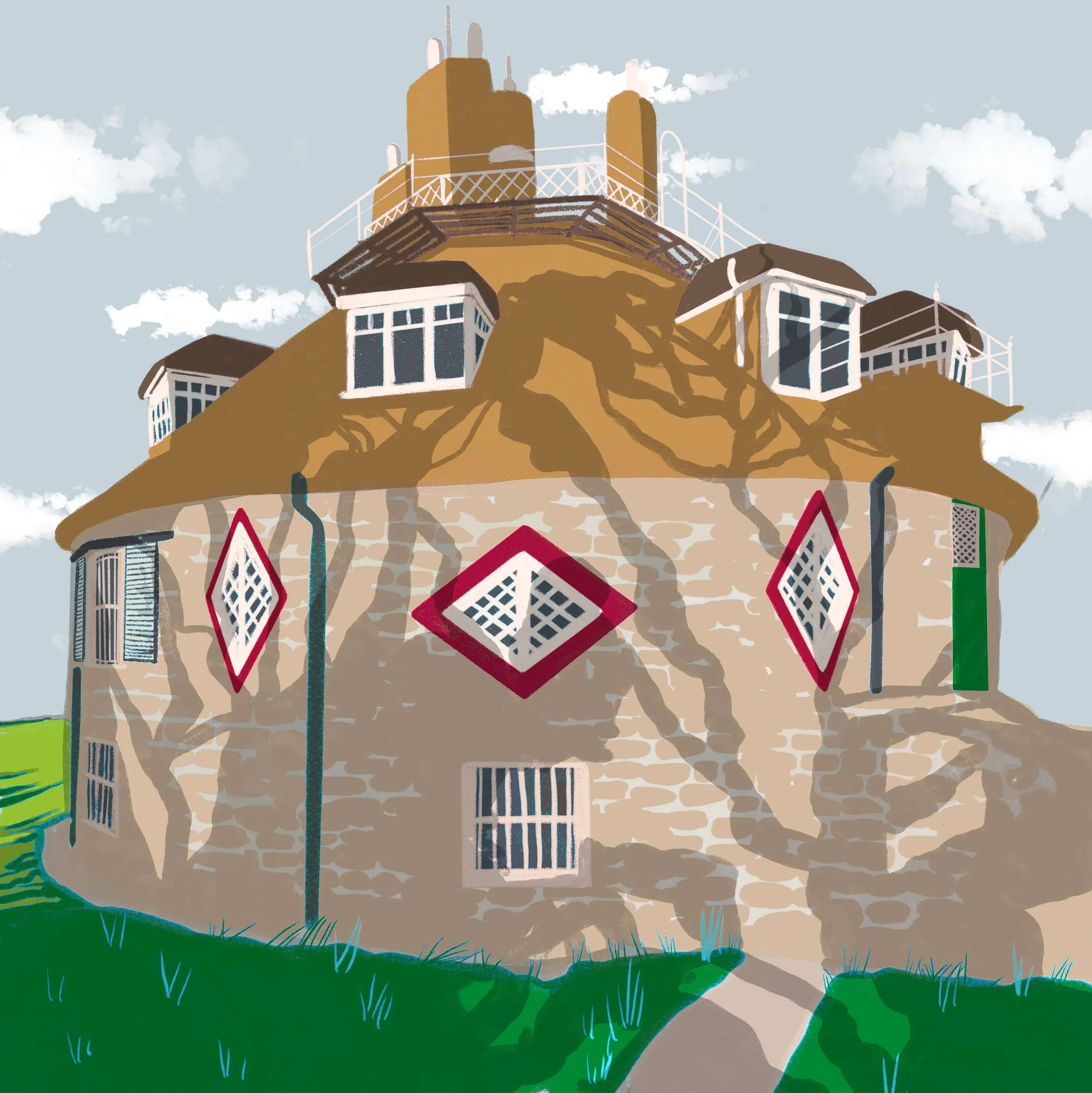
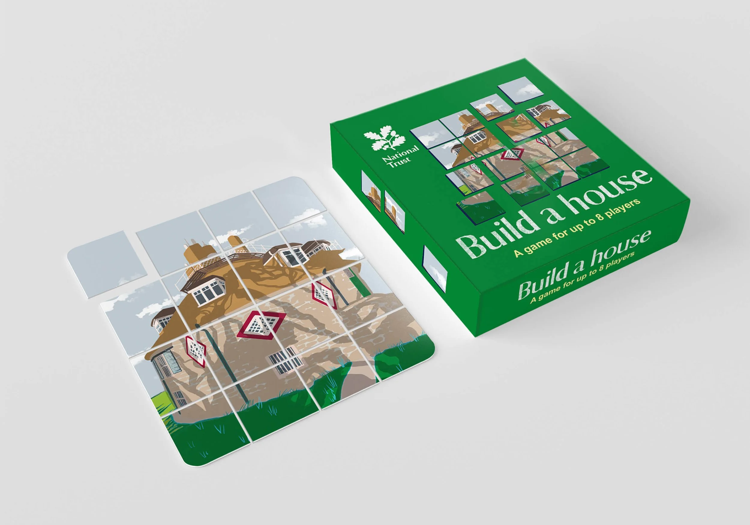
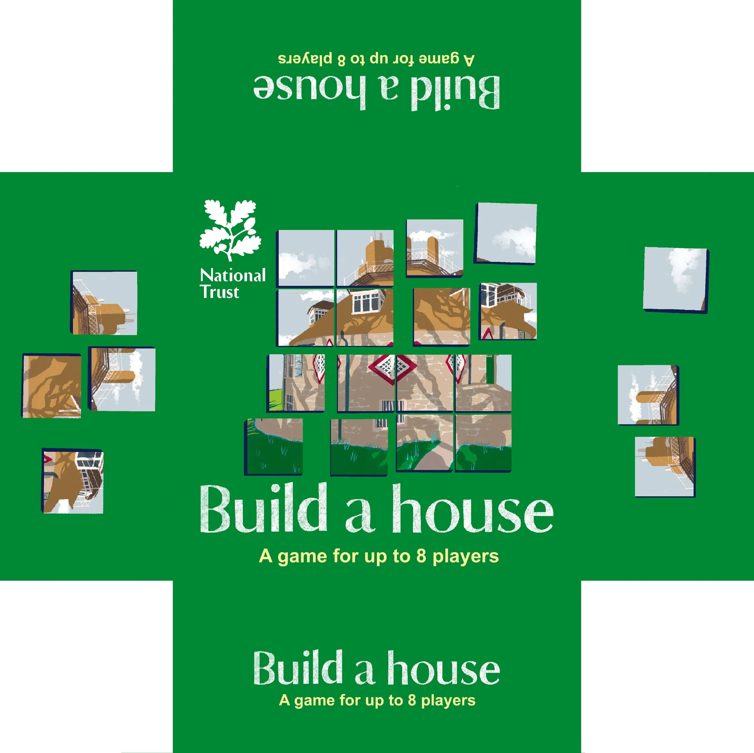
For this brief I illustrated an iconic National Trust property for a small jigsaw style card deck game where players reconstruct images of houses.
I also redesigned the box the game came in with modern National Trust branding.
-
Client: National Trust
Project: Build a House game
Commission Type: Freelance Illustration (Retail)Project Overview
We’re redesigning and publishing a new edition of our classic game ‘Build a House’ to be sold in National Trust gift shops.
We need 8 illustrations in a square aspect ratio. Colours should be close to the real colours of the buildings, and adhere to the National Trust’s branding rules of showing off nature and scenes in their natural beauty.
For the box, please keep to National Trust colours found in the branding guidelines, and pick at most three colours, but use neutrals such as white when needed.
1. Retail Products (Primary Use)
Each illustration should work both:
As an individual “hero” image
As part of a set or system of the Build a House game
Creative Direction
We are looking for a cohesive series of illustrations that:
Emphasise composition, symmetry, and colour logic within National Trust brand guidelines
Treat each building as part of a broader visual system or taxonomy
Tone & Aesthetic
Precise, intentional, and highly composed
Playful but controlled
Rooted in observation, but not purely referential
The work should sit at the intersection of:
Illustration as product (commercial appeal)
Illustration as interpretation
Must work at both distance (readable as pattern) and close inspection (detail-rich)
Avoid fine lines that may be lost in print
Colour palette should consider retail visibility (shelf impact)
-
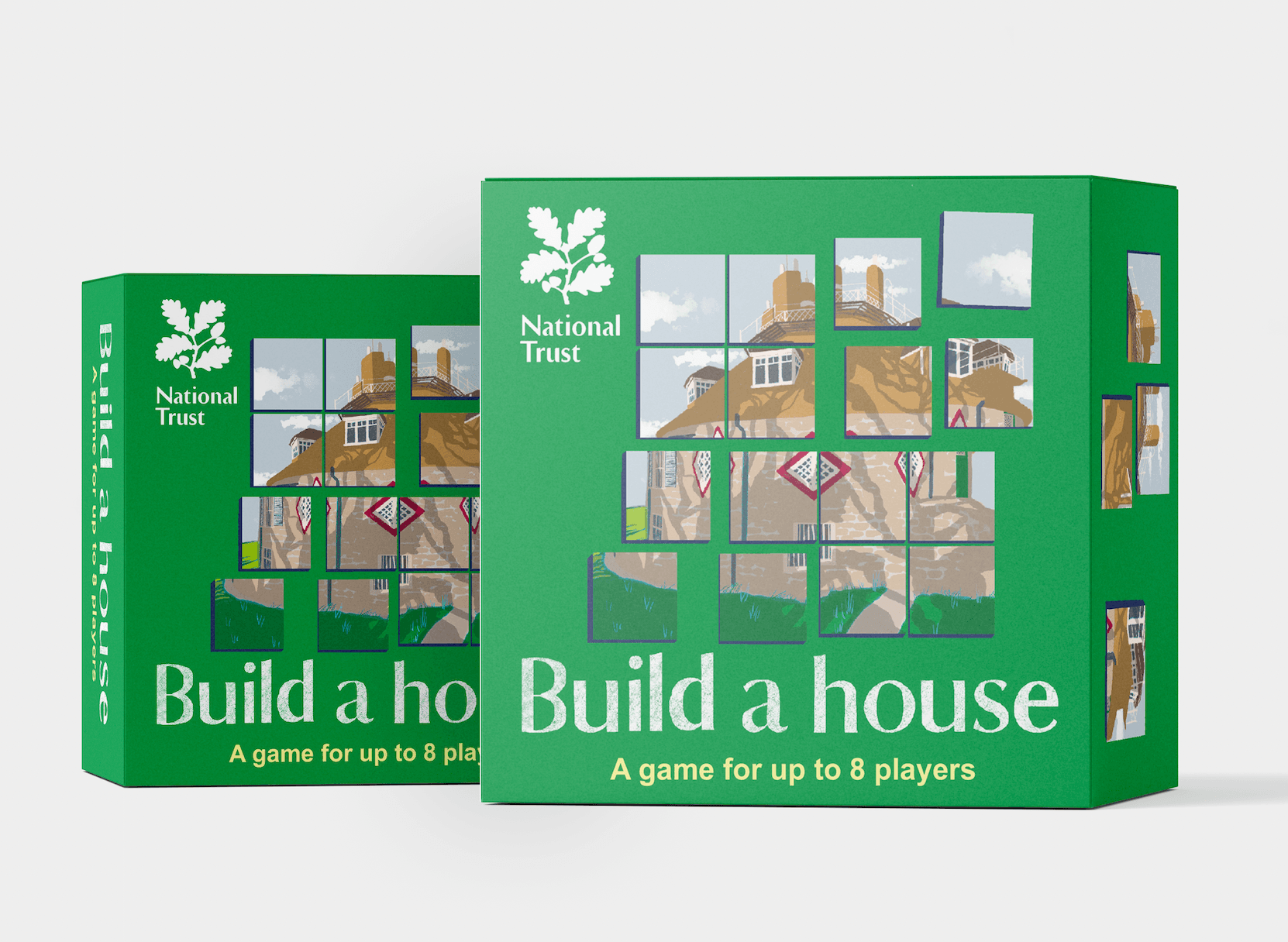
For this brief I illustrated two National trust properties that I felt were visually interesting and would engage someone playing the game.
I kept to a limited palette of colours from The National trust brand guidelines, choosing their iconic brand green, with white logo and light yellow text. The box green has enough punch to stand out on a shelf or display, and the white text on the deeper green is both accessible and restful.
The buildings themselves I drew in my characteristic textures brush with minimal outlines, relying on shape language so the illustration is appealing from close and at a distance.
For the ‘hero’ image I chose an interestingly shaped cottage witch distinctive red windows which contrasted nicely with the deep green of the box.
The illustration from the project could also be used separately as hero image on other projects, such as a notebook.
In completing this project one problem I came across was finding appropriate mock up boxes that were square, so I had to heavily edit some rectangular boxes.
Another challenge was recreating the official National Trust font. I requested it, but when it didn’t arrive I replicated it using hand lettering, which was a nice opportunity to use my textured brushes to lightly texture the lettering that reads ‘Build a House’, but I used this detail sparingly. I like how it echoes the texture of the main house illustration on the box.
I also used the same detail on the logo, before realising it wouldn’t be appropriate with the National Trust’s brand guidelines for logo use.